What AI Can't Touch: Rhiannon Lee on Protecting Creativity in a World of Shortcuts
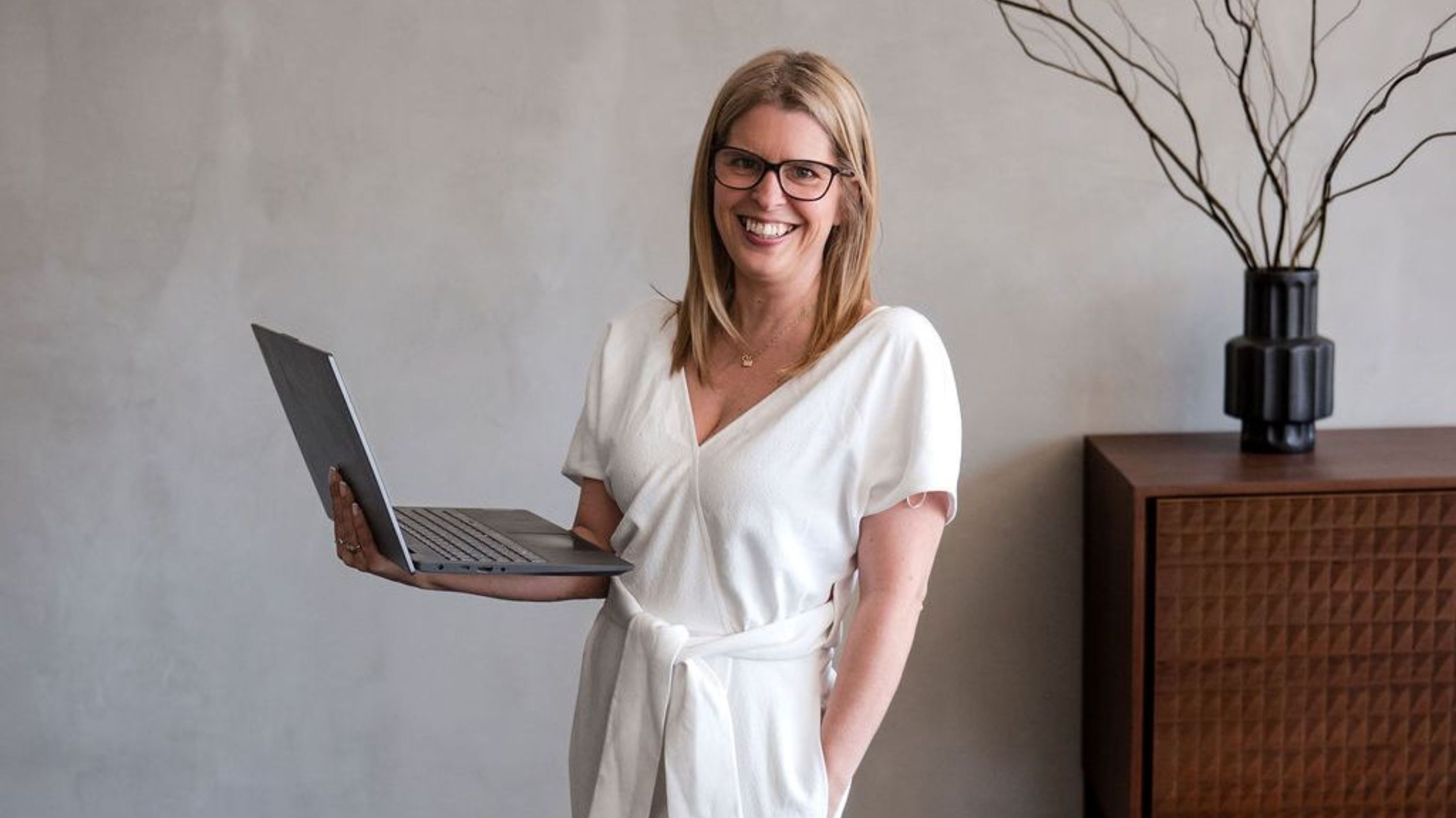
There's a version of the AI conversation that is almost entirely noise ... and then there's the one Rhiannon Lee has been having quietly inside her own business for nearly four years.
The founder of Oleander & Finch Interiors arrived in this episode carrying a story she rarely shares publicly. Her father, reflecting on her career, observed something she hadn't quite named herself: that the way she designs spaces ... the care, the safety, the sense of permanence she builds into every project ... might have everything to do with a childhood spent moving between schools and communities, never quite landing somewhere that felt like home. It's the kind of origin story that reframes everything. Design, in Rhiannon's hands, was never just about aesthetics. It was always about belonging.
That same instinct for protection threads through her approach to AI. While the design world has been busy chasing render generators and SketchUp shortcuts, Rhiannon has been making the opposite argument: ke...
AI Won't Design Your Home Renovation ...and that's the point.
There’s a lot of noise around artificial intelligence right now. Depending on who you listen to, it’s either about to change everything or quietly take over parts of our industry.
As designers, we’ve been watching this closely. More importantly, we’ve been using it in our own studio to understand where it genuinely helps and where it falls short.
Here’s what we’ve found.
AI is useful. Sometimes incredibly useful. But it doesn’t design homes.
And honestly, that distinction matters more than people think.
AI is already in the renovation process ...whether you realise it or not
Let’s talk about what’s actually happening on the ground.
Homeowners are already using AI tools to:
- Research renovation ideas
- Compare materials and products
- Break down building jargon
- Plan room layouts
- Estimate project timelines
- Pull together mood boards and references
Even if you’re not actively using AI, chances are you’ve already seen it through search engines, social platforms, or design ...
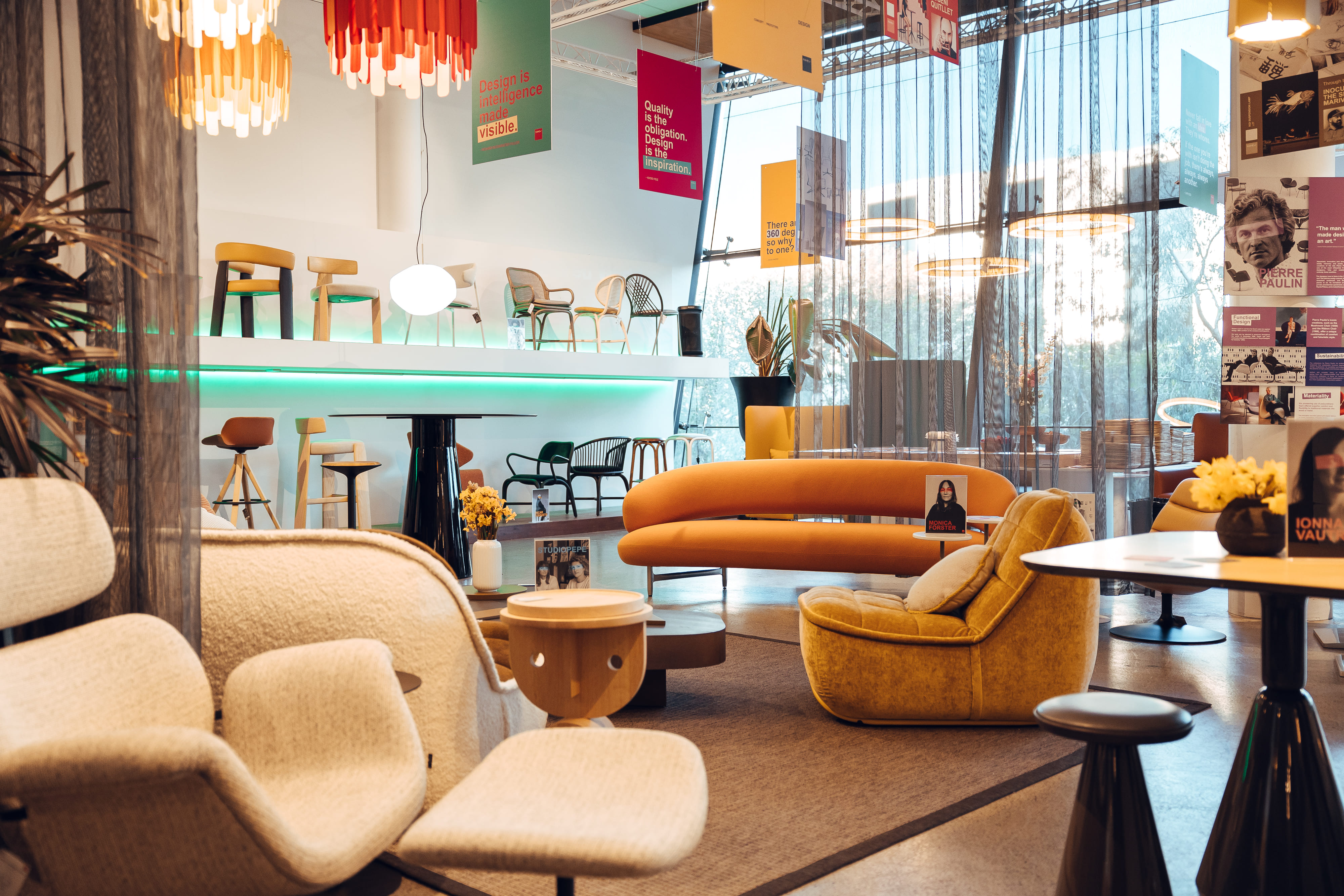
The Power of Visual Storytelling and Staying True to Yourself

What makes visual storytelling actually connect?
In the latest episode of A Designer’s Perspective, we sit down with Melbourne-based Creative Director, photographer and videographer Stef Hanson of Stef Hanson Productions known for her authentic storytelling and dynamic visual campaigns, with a difference for a conversation that goes well beyond cameras, content and campaigns.
With a strong background in sports and sports media, she hosted the hugely successful multimedia platform for women in sport for 15 years, which saw her traveling the globe interviewing professional athletes, covering events and creating content. In 2021 she transitioned and founded Stef Hanson Productions.
Her approach blends creative problem-solving with technical expertise, delivering campaigns that resonate with audiences and stand out in a crowded market.
Stef's portfolio spans various industries, including lifestyle, fashion, and sports, showcasing her versatility and commitment to capturing genuine mom...
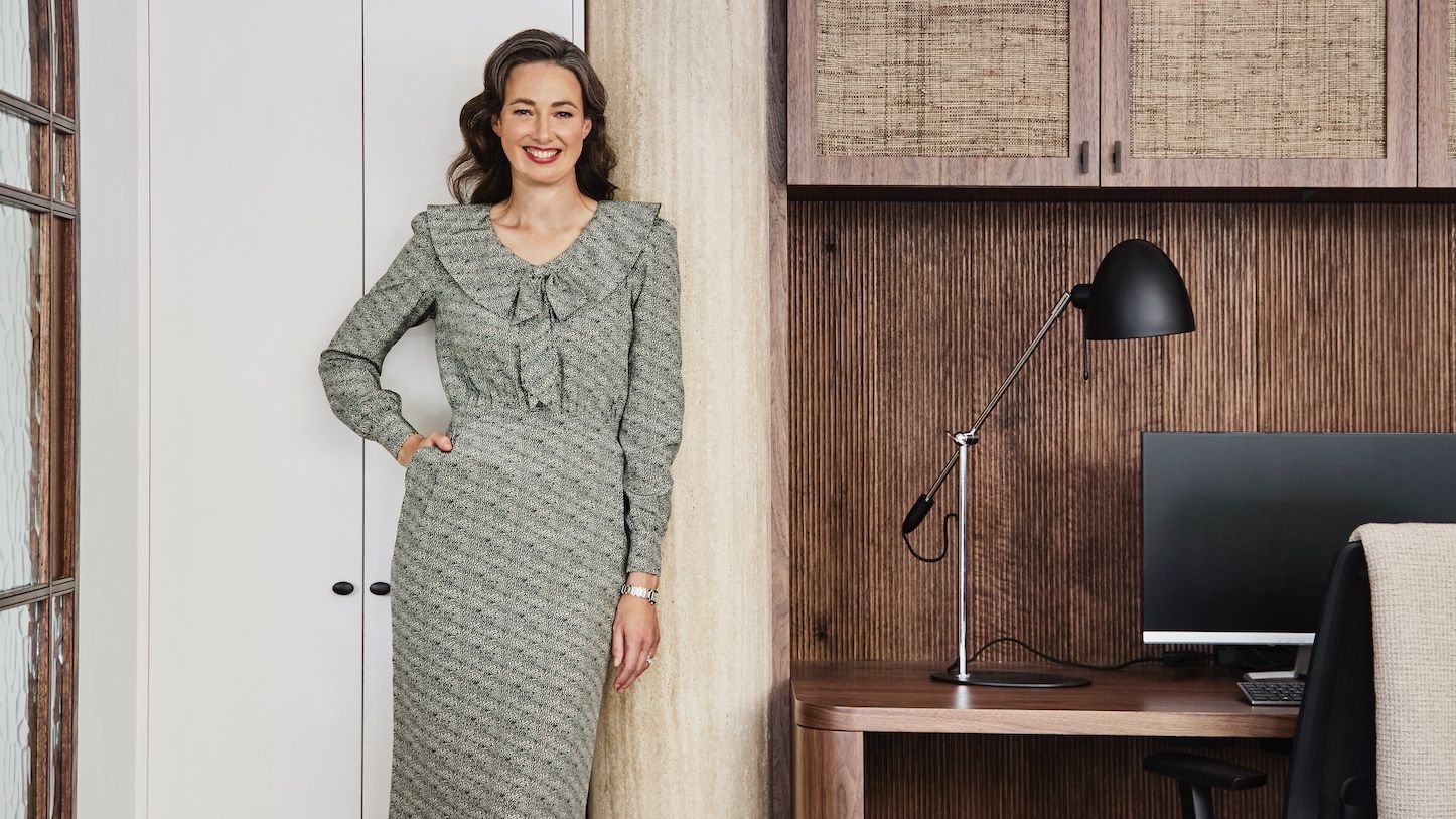
From Marketing to Design: A Conversation with Linda Habak / Studio LHD
In our latest episode of A Designer’s Perspective, we sit down with Linda Habak, Founder, Principal Designer and Director of Studio LHD in Sydney, and co-founder of Rosebriar Developments.
Linda’s story is one many creatives will relate to. While design was her first love in high school, her career initially took her into marketing. It wasn’t until later that she returned to design, drawn back by the need for a genuine creative outlet. That return wasn’t accidental. It was intentional, considered and shaped by experience.
A Practice Built on Both Creativity and Structure
Today, through Studio LHD, Linda works across residential and commercial interiors, with particular strength in renovations and new builds. Her projects span spatial planning, custom kitchens and bathrooms, joinery, lighting, finishes, furniture selection and the finer decorative details that give a space personality.
What stands out in our conversation is her balanced approach. Her work often blends heritage and m...
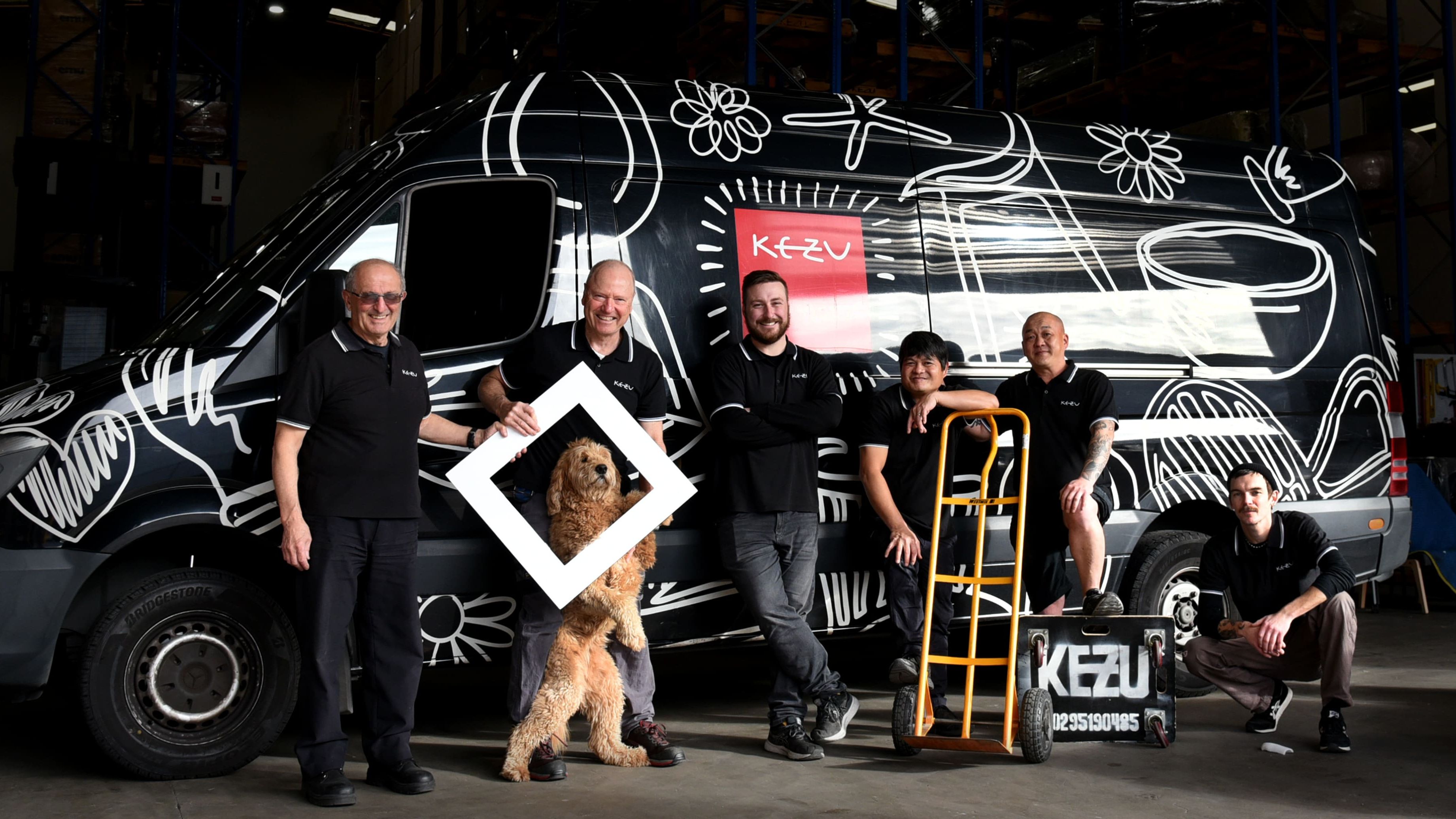
What Really Matters When Choosing Furniture, With Caron Grunschlag From Ke Zu Furniture
Not everyone’s path into the design industry starts with fabrics and floor plans. Sometimes it starts in a completely different world.
In the latest episode of our podcast A Designer’s Perspective, we sit down with Caron to talk about her journey from a career in finance into the design industry and her role at Ke Zu Furniture. Her story is a great reminder that career pivots can lead you exactly where you are meant to be, especially when they are driven by a genuine passion for small business and great design.
Listen to the episode here Podcast Link
But this conversation goes far beyond career paths. We dive into what truly matters when selecting furniture, especially for homes where comfort, quality, and longevity are non negotiable.
Why Quality and Warranty Should Never Be an Afterthought
Furniture is an investment. Yet so many decisions are still made based on how a piece looks in a showroom, rather than how it will perform over time.
Caron shares why quality and warranty n...
From Factory Floor to Design Excellence: The Journey of Kate Nixon
Growing up surrounded by the hum of machinery and the scent of fresh wood, Kate Nixon's path to becoming a renowned designer was anything but ordinary. Her story is a testament to the power of passion and perseverance in the world of design.
A Childhood Among Craftsmen: Kate's early years were spent in her family's furniture workshop, where she developed a deep appreciation for craftsmanship and natural materials. "I grew up on the factory floor," she recalls, "surrounded by leather and wood veneers." This unique upbringing laid the foundation for her future in design.
The Unexpected Detour: Despite her early exposure to design, Kate's journey wasn't straightforward. She initially considered a career in architecture, only to find it wasn't her calling. A chance encounter with a family friend led her to a biscuit company called ‘Mother Meg's’ who exported globally...this is where she honed her skills in business and creativity.
Finding Her True Passion: Kate's foray into food styling...
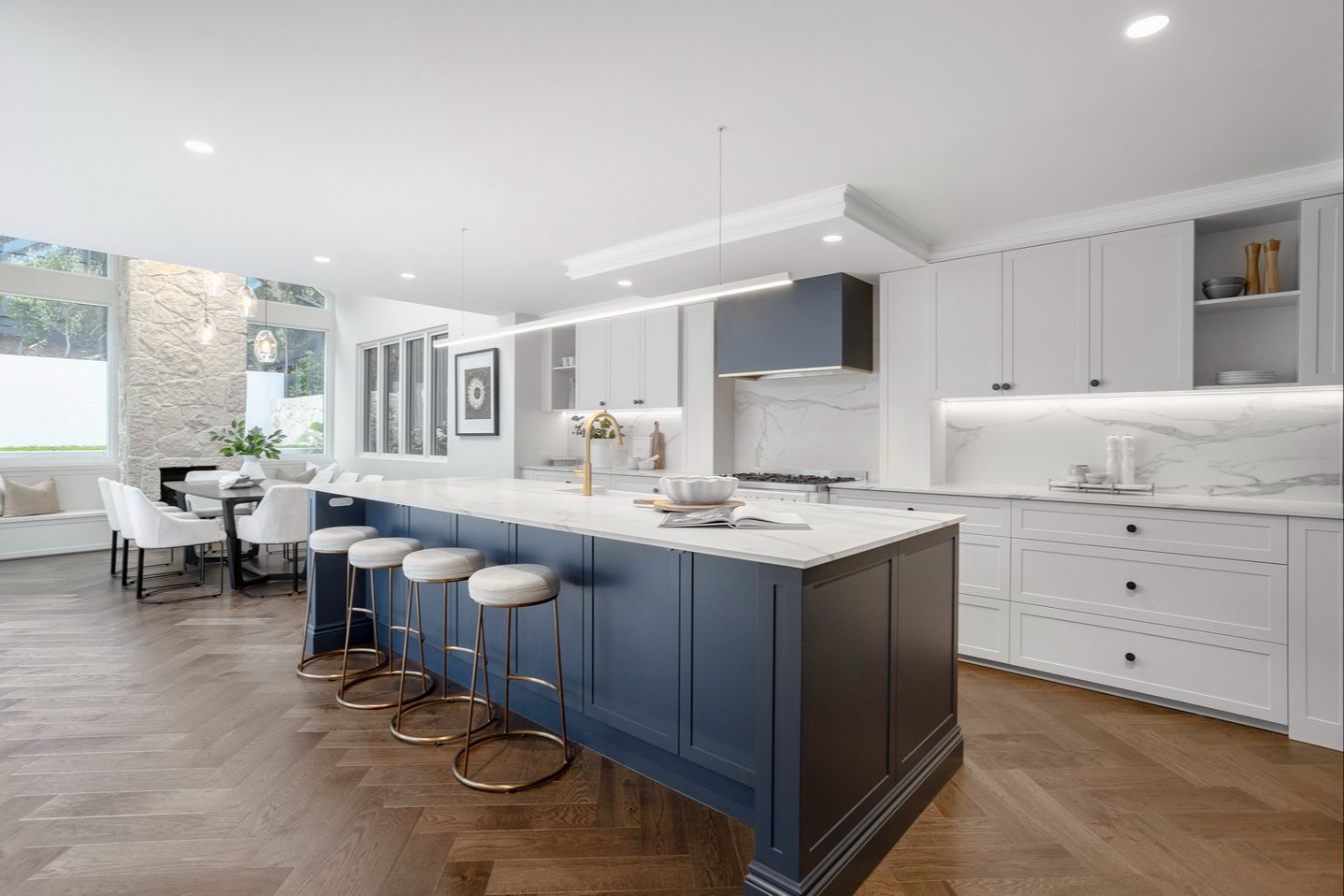
How to Juggle Your Build Budget Without Compromising on Design
When clients tell us they want a home that feels cohesive, calm, and well considered, our answer is always the same: it’s not about spending more money. It’s about spending it in the right places.
Great interiors are rarely made up of all high-end finishes or all budget selections. The most successful homes have a mix of price points within the fit-out budget, carefully balanced so the space feels intentional, not compromised.
The key is knowing where to invest and where to save.
Start with the big, permanent items
Some elements are hard or expensive to change later, so these are often worth allocating a little more budget to. Think:
- Flooring
- Joinery and cabinetry
- Kitchen benchtops
- Bathroom waterproofing and core finishes
These items set the tone of the home and are used every day. Getting them right upfront avoids costly changes down the track and helps the whole interior feel grounded and timeless.
Save on items that are easy to update
Not everything needs to be top sh...
Neale Whitaker... a name synonymous with Design & Style
We’re thrilled to kick off Season 2 of our podcast, “A Designer’s Perspective”, with a refreshed focus and exciting new direction. This season, we’re spotlighting Australia’s top creatives, diving deeper into their journeys, insights, and the stories that make them leaders in their field.
Our first episode features none other than Neale Whitaker, a true icon in the design world. From magazine publishing to television stardom, Neale’s career is a masterclass in creativity, adaptability, and staying ahead of industry shifts. Join us as we explore his evolution, the role of design media, and the lessons he’s learned along the way.
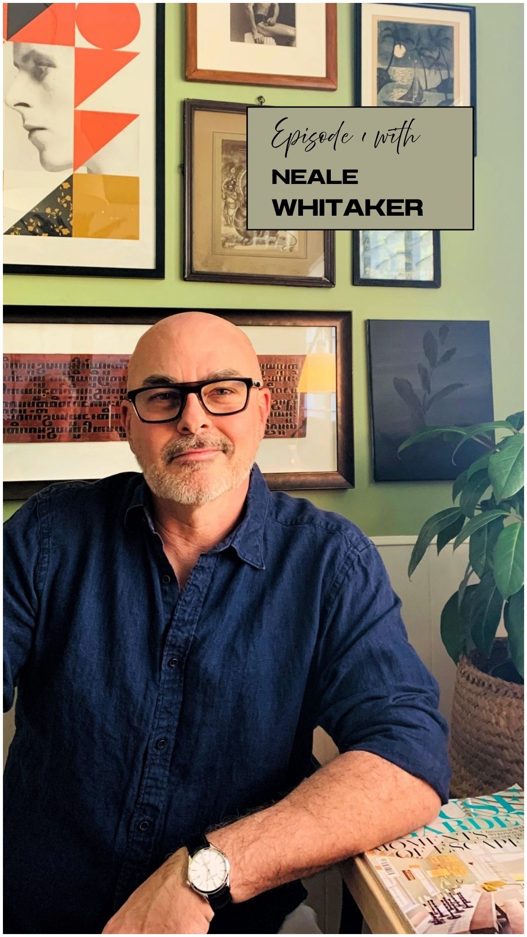
The Role of Design Magazines
Neale’s career began in the world of magazine publishing, where he quickly made a name for himself. "Design magazines shaped the industry," Neale shared, highlighting how these publications were once the primary source of inspiration for designers across the globe. As the industry shifted from print to digital media, Neale embra...
Interior Design Trends 2026: What’s In, What’s Lasting, and How to Make it Yours
2026 interiors are all about homes that feel personal, warm, and intentional.
Rather than chasing every trend, we’re seeing spaces designed to reflect real life, lifestyle, and lasting style.
Before we dive into the 'trends' we need to make mention of Pantone's 2026 colour of the year.
Pantone’s Colour of the Year, Cloud Dancer, signals a return to soft neutrals and calm spaces. It’s an elegant shade that offers a quiet backdrop for interiors and works beautifully with texture and natural materials. That said, we don’t always agree that neutrals should dominate. For many homes, colour grounded in personality creates more life and longevity than a single “safe” palette. We see colour working with a home’s character, not replacing it.
Colour With Purpose
Rich tones are back. Deep greens have dominated for a while, but blues are starting to take over, bringing a fresh, calming vibe to interiors. Warm neutrals, jewel shades, and intentional accent colours are also in play, creating im...
Holding Warmth: The Treehouse by McRae + Lynch Design
When Interior & Building Designer Karyn McRae’s mother, Pam, suggested building a small flat on their southern Sydney property, the request was simple — a quiet place to call home. But Karyn saw more.
She reimagined the family home completely, creating two living zones that connect across levels and generations. The result is The Treehouse — a renovation filled with light and outlook.
Shaping A Home Around Warmth
The original 1950s house sat on a steep, leafy block with views across the Royal National Park. Karyn expanded the footprint opening up living areas to the south and drew the landscape inside. Walnut joinery, brushed bronze tapware, and sintered stone add depth, while a soft palette lets the greenery outside hold the spotlight.
“The design response centres on connection to place, to light, and to daily living,” - Karyn McRae.
And at the heart of it — the fireplace.

Choosing A Fireplace With Presence
Karyn didn’t want a fireplace that disappeared into the walls. Sh...
